Unlocking the Power of KPIs: How Salesforce and Tableau Make Reporting Actionable
Salesforce isn’t just a CRM—it’s a full-featured platform built to help businesses grow smarter, faster, and more efficiently. But to make real progress, you need to know exactly how you’re doing. That’s where KPIs (Key Performance Indicators) come in.
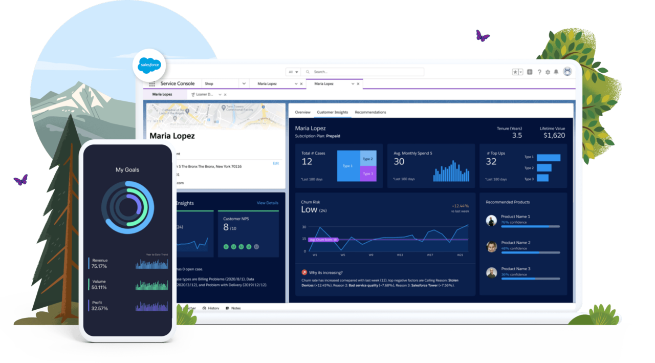
Tracking KPIs is essential for measuring progress toward your goals, and Salesforce offers powerful, flexible tools to create, visualize, and act on those metrics. Whether you’re in Sales, Service, or Marketing, Salesforce has the features to make your KPIs more actionable and impactful.
Why Use Salesforce for KPI Reporting?
Salesforce is more than capable of tracking performance—it’s built to drive performance. It doesn’t just show you what happened; it helps you understand why, predict what’s next, and guide teams toward what to do.
With the right setup, Salesforce becomes your KPI command center, and when you integrate Tableau, you unlock even more power for data visualization and advanced analytics.
Salesforce Features for Building KPI Reports
Here are the key tools and features in Salesforce you can use to create, manage, and visualize KPI reports:
1. Reports & Dashboards
Your core tools for real-time KPI tracking.
-
Standard Reports: Easily report on opportunities, leads, cases, and more.
-
Custom Reports: Tailor data views to your specific KPIs.
-
Dashboards: Visualize your KPIs with charts, gauges, and tables.
-
Filters & Drilldowns: Zoom in on teams, time periods, or territories.
Example: Create a dashboard showing Sales KPIs like Pipeline Value, Win Rate, and Forecast Accuracy—updated in real-time.
2. Custom Fields & Formula Fields
KPIs often need calculations—Salesforce lets you build those right into your data.
-
Use formula fields to calculate things like conversion rates, SLA adherence, or ROI.
-
Use custom fields to track KPIs unique to your organization or industry.
Example: Track a “Customer Health Score” based on product usage, support cases, and engagement—all in one field.
3. Goals & Performance Management
Set measurable goals and track progress over time.
-
Use the Performance Management features in Sales Cloud to set rep-specific targets (e.g., quarterly quota).
-
Visualize goal progress right in dashboards or Lightning components.
Example: Compare each sales rep’s closed deals against their monthly quota, automatically updated from live opportunity data.
4. Einstein Analytics (CRM Analytics)
For advanced users looking for deeper, AI-powered insights.
-
Build predictive dashboards using historical trends.
-
Spot KPI anomalies automatically with AI insights.
-
Forecast future performance and uncover hidden patterns.
Example: Use Einstein to predict lead conversion likelihood and adjust campaign tactics based on real-time scoring.
5. Marketing Cloud Intelligence (Datorama)
For marketers tracking KPIs across multiple platforms.
-
Consolidate data from email, social, ads, and web into a single view.
-
Build cross-channel dashboards to track performance from campaign to conversion.
-
Visualize marketing ROI clearly and confidently.
Example: Show ROI across all campaigns, broken down by channel, cost, and conversion in one place.
6. Scheduled Reports & Alerts
Stay proactive with automated reporting.
-
Set up scheduled email reports to share KPI data with teams.
-
Create threshold-based alerts for when KPIs fall outside of target ranges.
Example: Trigger an alert if case resolution time exceeds SLA limits, or if weekly revenue forecast drops below goal.
Salesforce + Tableau: The Ultimate Reporting Duo
While Salesforce provides robust tools for KPI tracking, Tableau—Salesforce’s powerful data visualization platform—takes your reporting to the next level. Tableau allows you to create highly interactive, visually engaging reports and dashboards that help you dive deeper into your data, uncover hidden patterns, and forecast future trends.
Here’s how Tableau enhances your Salesforce KPI reports:
Advanced Data Visualizations
Tableau’s visualizations help you see your KPIs like never before. With Salesforce data integrated into Tableau, you can create visually stunning charts, graphs, heat maps, and scatter plots that offer a more detailed understanding of your performance metrics. These visuals can highlight trends, relationships, and outliers that might not be immediately obvious in standard Salesforce reports.
Example: Visualize sales performance across multiple regions with heat maps that highlight areas of high and low sales activity, allowing you to take immediate action.
Predictive Analytics
Tableau brings powerful predictive analytics to Salesforce data. With machine learning models and statistical analysis, Tableau helps you forecast KPIs like sales revenue, customer churn, and product demand. This enables you to make proactive decisions rather than reactive ones.
Example: Use Tableau to predict next quarter’s sales figures based on historical performance, customer behavior, and seasonality trends.
Real-Time Data
Tableau integrates with Salesforce’s real-time data to provide up-to-the-minute insights. As soon as Salesforce data is updated, Tableau reflects the changes, allowing you to make decisions based on the most current information available.
Example: Track live sales opportunities and see them reflected instantly in Tableau dashboards, so your team can act on high-value opportunities as they arise.
Interactive Dashboards
Tableau’s interactive dashboards allow users to drill down into specific metrics to uncover deeper insights. Whether you’re exploring customer behavior, sales cycles, or marketing ROI, you can click through dashboards to get detailed, granular data.
Example: Click on a specific region in a Tableau sales dashboard to see detailed performance data for individual sales reps, allowing for tailored coaching and support.
Data Blending
Tableau’s data blending feature allows you to combine Salesforce data with data from other systems (like marketing platforms, ERP systems, or social media tools). This creates a comprehensive view of your KPIs, allowing for cross-departmental insights and better-informed decisions.
Example: Combine sales data from Salesforce with customer feedback data from surveys to build a unified view of customer satisfaction and sales performance.
Best Practices for KPI Reporting in Salesforce and Tableau
To make your Salesforce and Tableau KPI setup truly effective, here are some best practices to keep in mind:
-
Start with your goals: Align your KPIs with specific, measurable objectives that drive business growth.
-
Simplify and focus: While it’s tempting to track a wide array of metrics, focus on the KPIs that matter most to your success.
-
Tailor dashboards to roles: Ensure each team has a dashboard that shows the KPIs relevant to their responsibilities. Sales reps should see sales KPIs, while marketing teams should focus on campaign performance.
-
Review and iterate: As your business grows and evolves, so should your KPIs. Regularly review your reports to ensure they reflect the most important aspects of your business.
Final Thoughts
Salesforce gives you the tools to track, measure, and act on your KPIs—but when you integrate Tableau, you unlock an entirely new level of analytics and visualization. Whether you’re in Sales, Service, or Marketing, Salesforce and Tableau together help you stay aligned, focused, and data-driven. With real-time data, advanced analytics, and interactive dashboards, your team will be empowered to make smarter decisions, faster.
Choose the right metrics. Build meaningful reports. Set your team up to win—again and again.